Sequence Info for: chr2L_16702696_16703719

Plots of class: *CAGE_geneheatmap.*_nozoom

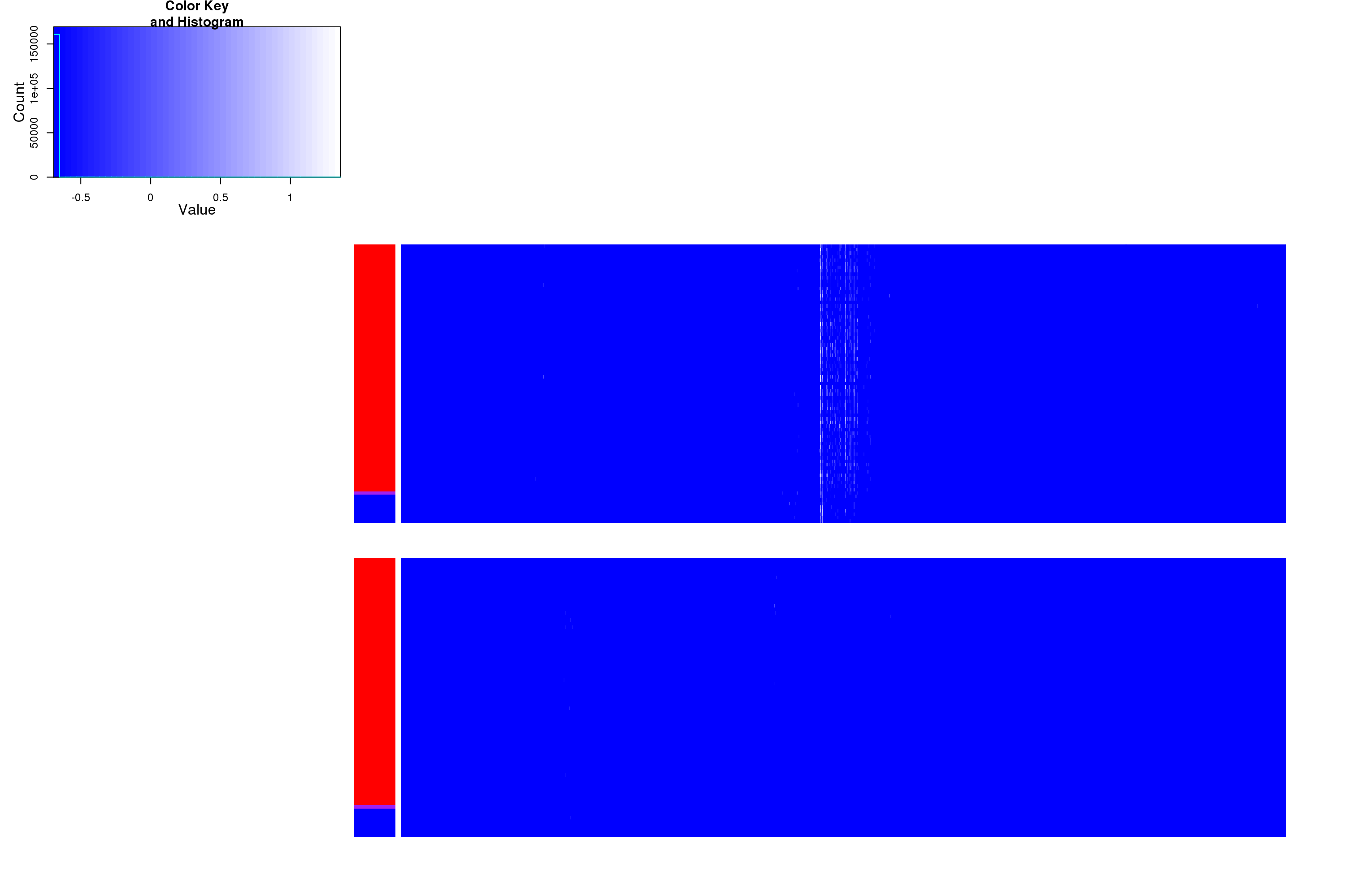
CAGE unzoomed image plots. Signal is filtered exactly as in QTL calling (i.e. removing mappability issues). In these image plots, each column represents a base pair centered on the strongest signal while each row represents an individual. Individuals are sorted by the genotype of the strongest associated SNP. Colors on the left of the image indicate genotype of the individual. Top and bottom panels represent signal on opposite strands. Intensity of CAGE signal is displayed on a log scale where more white indicates more CAGE signal." "From left to right:
chr2L_16702696_16703719_CAGE_geneheatmap_byMinCommonP_nozoom_1012h
chr2L_16702696_16703719_CAGE_geneheatmap_byMinCommonP_nozoom_24h
chr2L_16702696_16703719_CAGE_geneheatmap_byMinCommonP_nozoom_68h

Plots of class: *CAGE_geneheatmap.*_zoom

CAGE zoomed image plots. Zooming is such that only bases with total CAGE signal above a threshold are shown. Non-Adjacent base pairs are labeled below the image. In these image plots, each column represents a base pair centered on the strongest signal while each row represents an individual. Individuals are sorted by the genotype of the strongest associated SNP. Colors on the left of the image indicate genotype of the individual. Top and bottom panels represent signal on opposite strands. Intensity of CAGE signal is displayed on a log scale where more white indicates more CAGE signal." "From left to right:
chr2L_16702696_16703719_CAGE_geneheatmap_byMinCommonP_zoom_1012h
chr2L_16702696_16703719_CAGE_geneheatmap_byMinCommonP_zoom_24h
chr2L_16702696_16703719_CAGE_geneheatmap_byMinCommonP_zoom_68h

Plots of class: *_CAGE_geneHist.*_nozoom

CAGE unzoomed bar plots. Signal is filtered exactly as in QTL calling (i.e. removing mappability issues). Each base is represented on the X-axis. The Y-axis represents the raw intensity of CAGE signal after normalizing to read depth. Different colored bars represent different genotype classes with red and blue representing different homozygotes and purple representing heterozygotes" "From left to right:
chr2L_16702696_16703719_CAGE_geneHistLike_byMinCommonP_nozoom_1012h
chr2L_16702696_16703719_CAGE_geneHistLike_byMinCommonP_nozoom_24h
chr2L_16702696_16703719_CAGE_geneHistLike_byMinCommonP_nozoom_68h

Plots of class: *_NoFilterCAGE_geneHistLike.*_nozoom

CAGE unzoomed unfilterred bar plots. Signal is filtered exactly as in QTL calling (i.e. removing mappability issues). Each base is represented on the X-axis. The Y-axis represents the raw intensity of CAGE signal after normalizing to read depth. Different colored bars represent different genotype classes with red and blue representing different homozygotes and purple representing heterozygotes" "From left to right:
chr2L_16702696_16703719_NoFilterCAGE_geneHistLike_byMinCommonP_nozoom_1012h
chr2L_16702696_16703719_NoFilterCAGE_geneHistLike_byMinCommonP_nozoom_24h
chr2L_16702696_16703719_NoFilterCAGE_geneHistLike_byMinCommonP_nozoom_68h

Plots of class: *_CAGE_geneHist.*_zoom

CAGE zoomed bar plots. Zooming is as in heatmaps. Signal is filtered exactly as in QTL calling (i.e. removing mappability issues). Each base is represented on the X-axis. The Y-axis represents the raw intensity of CAGE signal after normalizing to read depth. Different colored bars represent different genotype classes with red and blue representing different homozygotes and purple representing heterozygotes" "From left to right:
chr2L_16702696_16703719_CAGE_geneHistLike_byMinCommonP_zoom_1012h
chr2L_16702696_16703719_CAGE_geneHistLike_byMinCommonP_zoom_24h
chr2L_16702696_16703719_CAGE_geneHistLike_byMinCommonP_zoom_68h

Plots of class: *DNA_geneheatmap.*_zoom

DNA unzoomed heatmap. This is identical to the unzoomed CAGE image plot however intensity represents the intensity of signal using raw DNA-sequencing as a phenotype. These plots are meant to highlight potential errors not caught in our mapability filters." "From left to right:
chr2L_16702696_16703719_DNA_geneheatmap_byMinCommonP_zoom

Plots of class: *DNA_geneheatmap.*_nozoom

DNA zoomed heatmap. This is identical to the zoomed CAGE image plot however intensity represents the intensity of signal using raw DNA-sequencing as a phenotype. These plots are meant to highlight potential errors not caught in our mapability filters. Top and bottom panels are identical" "From left to right:
chr2L_16702696_16703719_DNA_geneheatmap_byMinCommonP_nozoom

Plots of class: *ReadsByFilterBarplot

Filter effect barplot This plot gives the number of reads remaining in this region before any filteres, after only the UMM filter, and after the WASP filter" "From left to right:
chr2L_16702696_16703719_ReadsByFilterBarplot

Plots of class: *Manhatan

Manhatan plot " "From left to right:
chr2L_16702696_16703719Manhatan3PC